For over two decades, Pantone’s colour of the year has impacted product development, packaging, and purchasing in multiple industries. The interior design industry is no exception. The Pantone’s colour of the year has been the inspiration behind many innovative interior design products.
The selection process of the Pantone colour of the year demands intensive trend analysis and thoughtful consideration. The Pantone colour institute research is exhaustively looking for new colour influences. This research ranges from travelling art collections, fashion, playstyles, travel destinations, socio-economic conditions, etc. Influences also root from textures, materials, technologies, and worldwide events.


Pantone Colours of 2021
Pantone named two shades this year, Ultimate Grey and Illuminating (a hue of yellow), as its colours of the year for 2021. A union of colour conveying a message of strength and hopefulness that is both enduring and uplifting. Pantone firmly believes that these shades’ pairing will support people to strengthen themselves with hope, clarity, and energy, especially during the uncertain times of the unprecedented pandemic.
The Ultimate Grey is a quieter hue that speaks about composure, steadiness, and resilience. Simultaneously, the bright yellow shade, called Illuminating, is meant to evoke an optimistic promise of a sunshine-filled day.
Two Colours for the 2nd Time in History
Pantone revealed that it is the first time grey, an achromatic shade has been chosen, and the second time two colours are being picked. In 2016, this revolution took place where the pale pink and blue hues, Rose Quartz, and Serenity were handpicked as the year’s colours.
Pantone wants to hint at the importance of solidarity in the coming year by picking two independent and contrasting colours. This will also highlight how different elements come together to express this message of strength and hopefulness.


Global Impact
Combining these two handpicked colours converse with the optimism, hope, and resilience that the world needs to renew, reset, and reimagine. The Pantone Colours 2021 reflects the global culture’s shape, expressing what people are looking for. These colours represent a critical form of communication and a way to symbolize thoughts and ideas.
Ultimate Grey and Illuminating in Home Décor
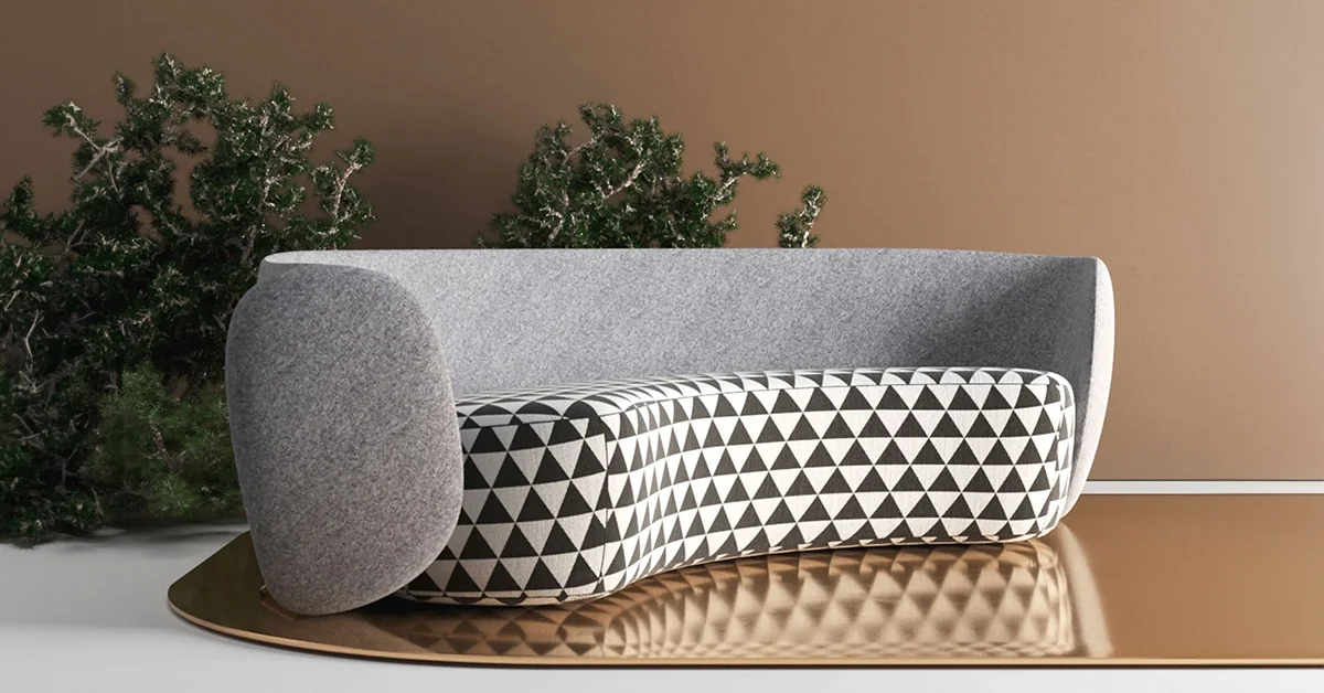
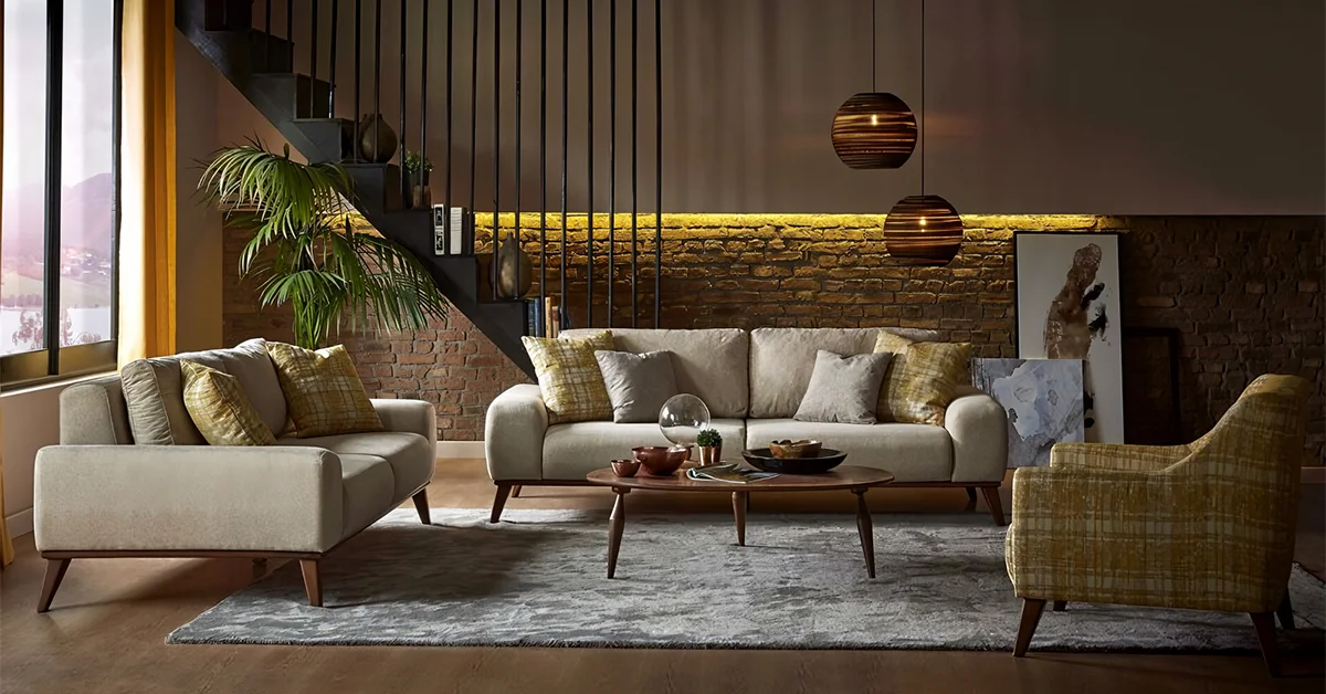
With 2020’s global pandemic, these colours are meant to soothe, calm, or uplift. Ultimate Grey and Illuminating are a great combination to add a dose of positivity and sunshine in any room. Collocating Illuminating with Ultimate Grey in furniture, upholstery, linens, and home accessories including tabletops, runners, curtains, and pillows infuses vitality and liveliness.
Whether it is a commercial space or home interiors – Ultimate Grey and Illuminating, the ideal combination for any interior will enhance intuition, lighting the way to the intellectual curiosity, originality, and resourcefulness of an open mind.

Arcedior is the most loved curated interior design products platform which is changing the way interior designers, architects and project owners discover and source products for their various projects.
Our user-friendly platform combines online product selection for interiors and elaborate project management along with offline sourcing support for our clients.


